David’s been back in touch with his Hornby DCC 8×4 layout.
And he’s a great example of why it’s all about ‘making a start’.
Have a look at his first post here.
Now have a look at where he is:
“Hi Alastair,
So excited to see my railway pic published on your site. I thought I’d send an update on how it turned out.
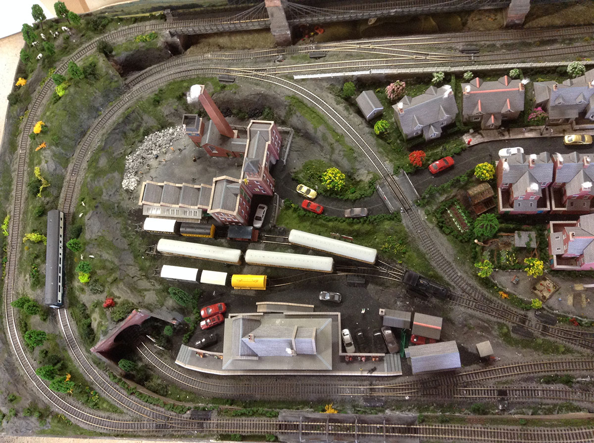
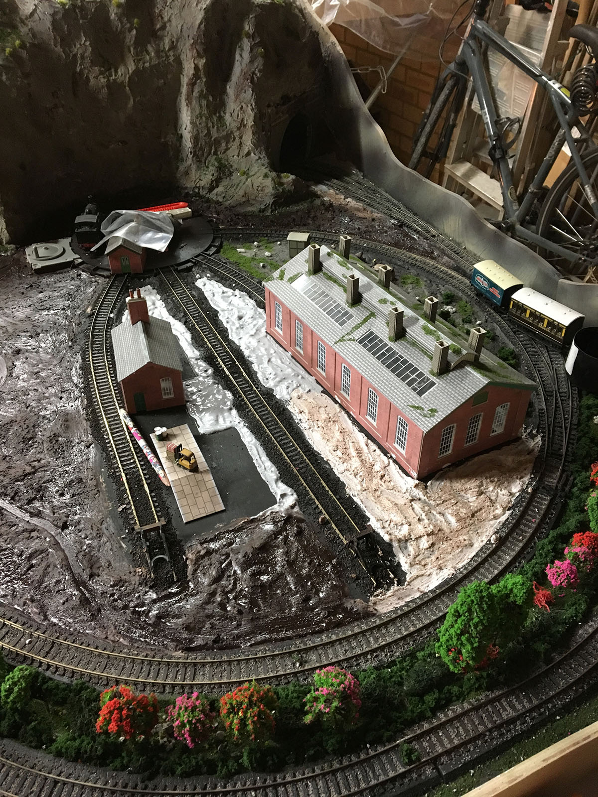
I did modify the track layout eventually, to have one long outer loop rather than two loops.
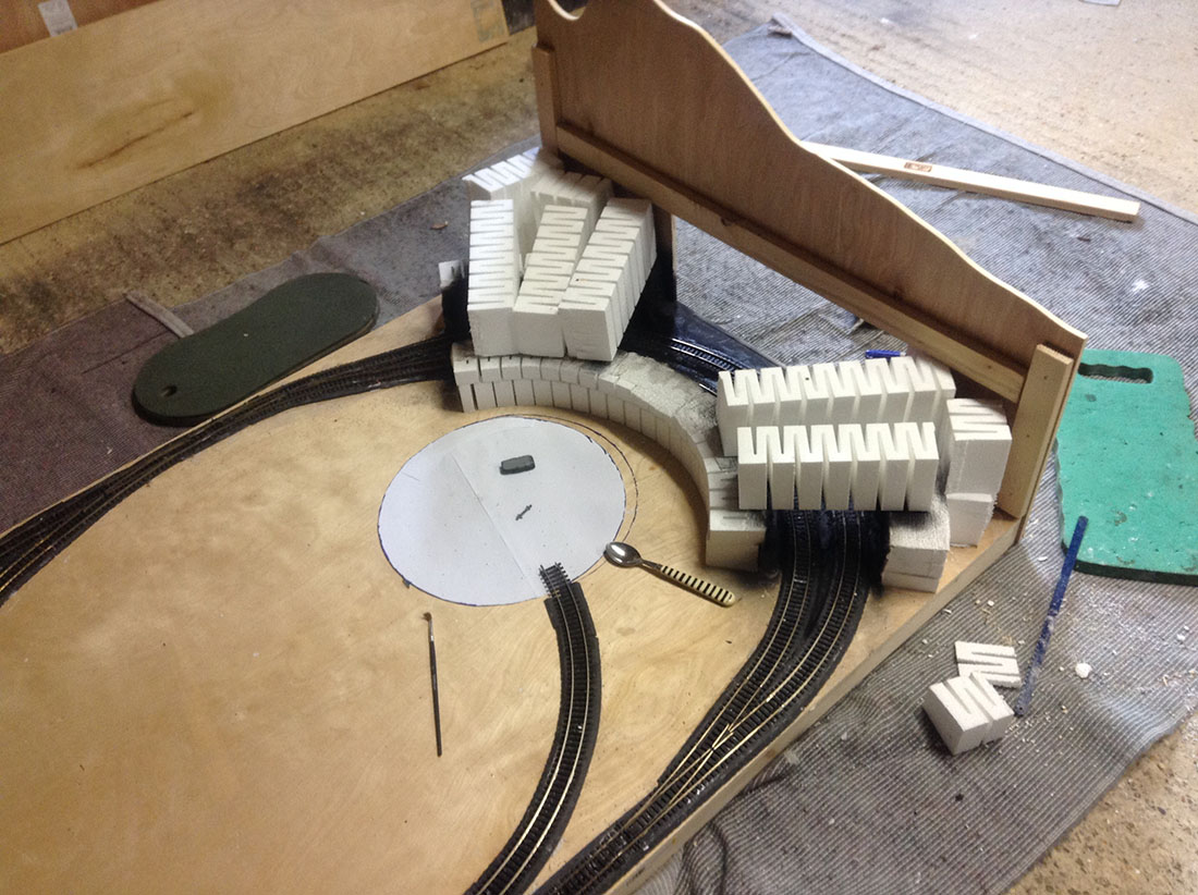
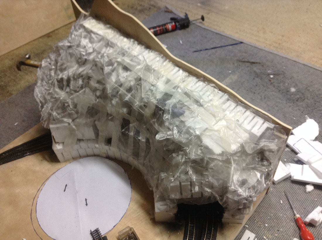
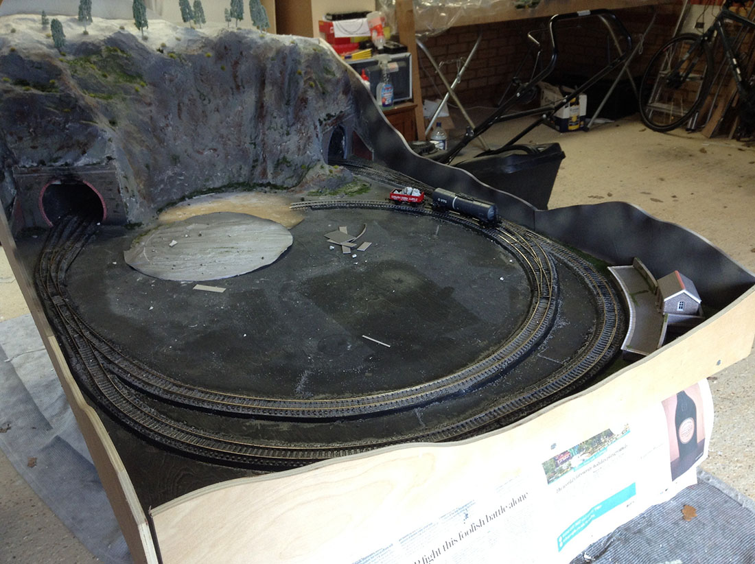
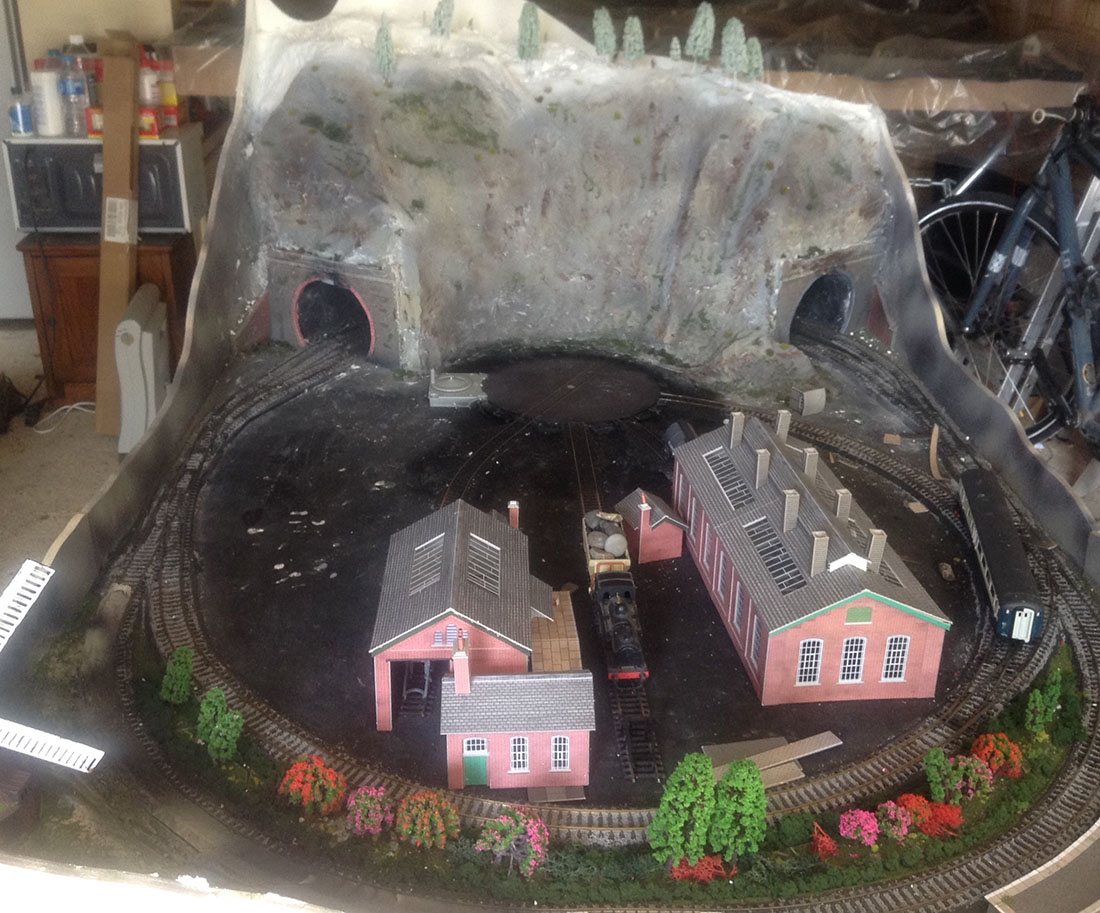
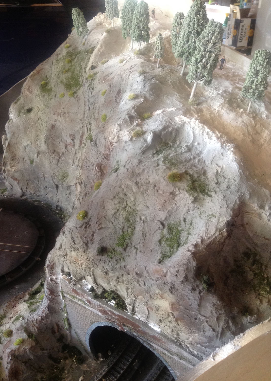
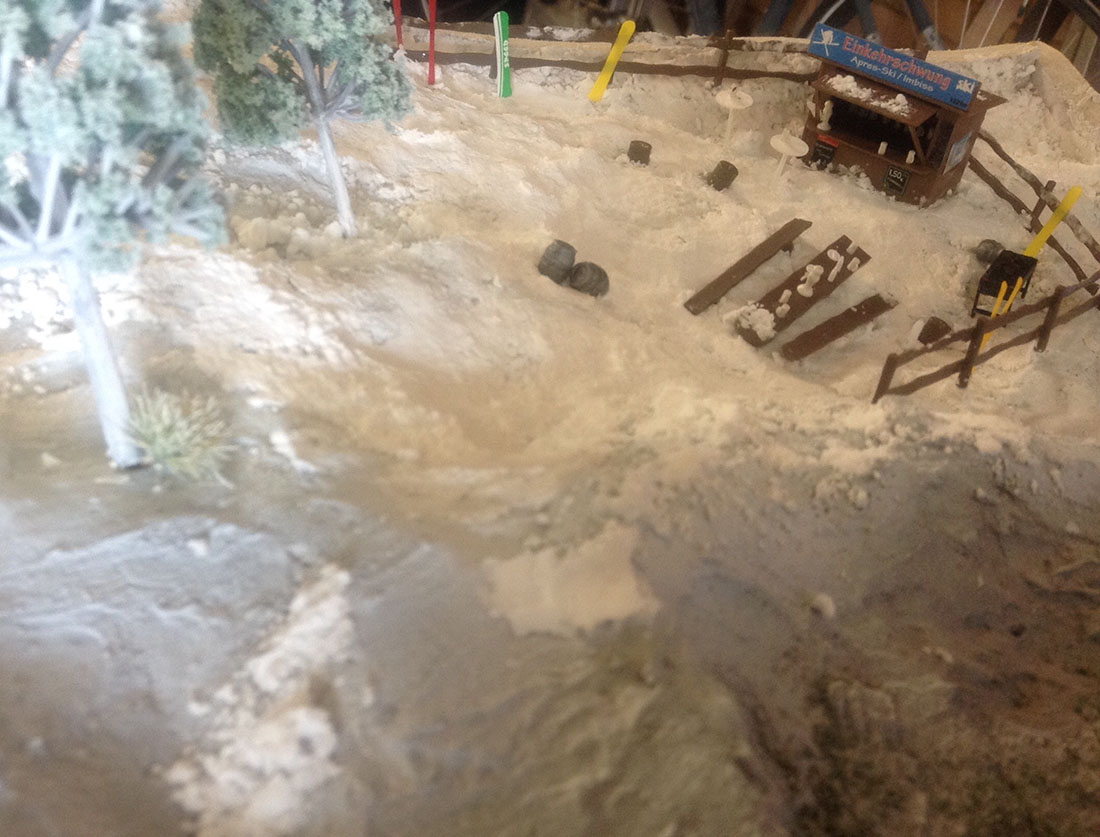
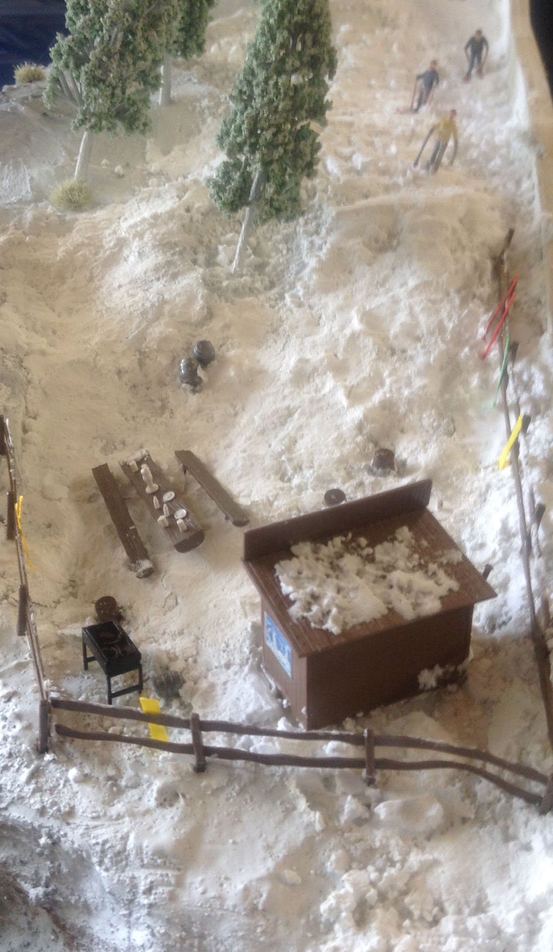
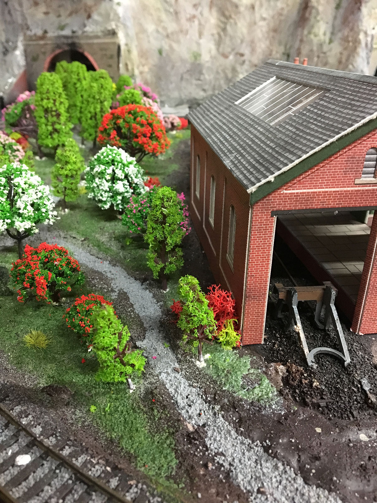
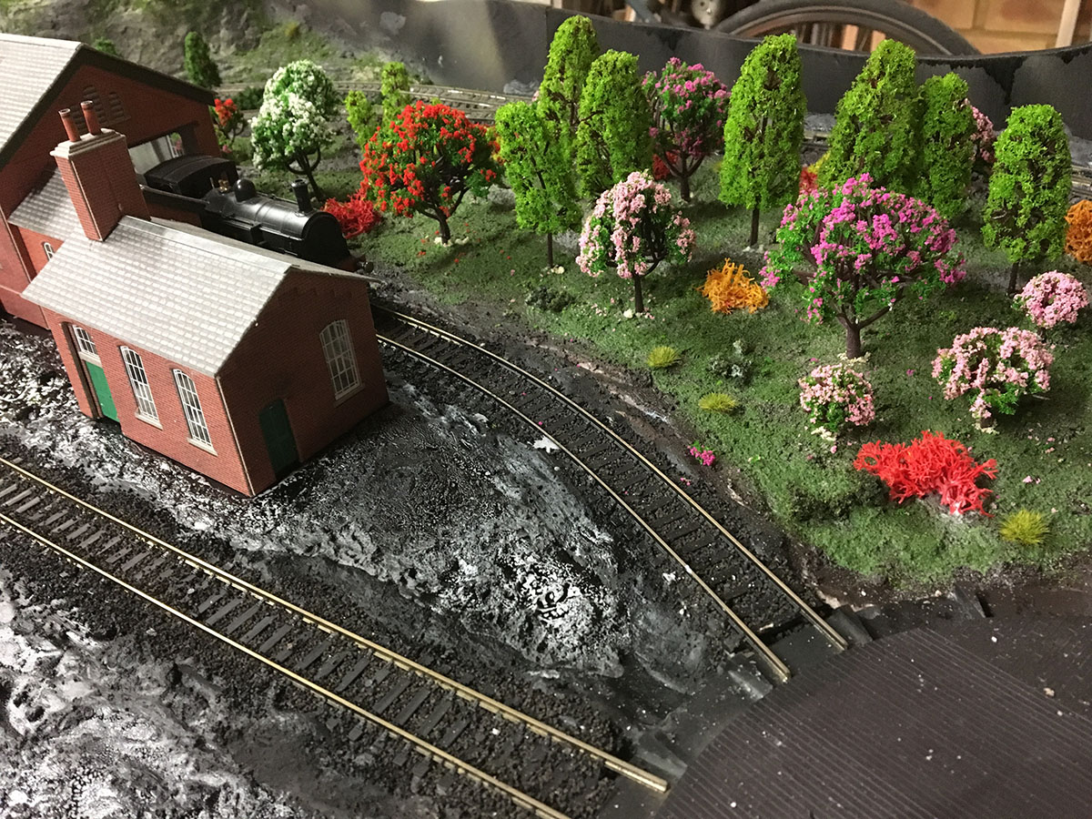
I also made a smaller layout using the “left overs” from the main track. My son wanted a mountain with skiers, so I send you some pics of that small layout too.
Keep up the great work, always look forward to your mails,
David”
A huge thanks to David for sharing his Hornby DCC – I think his layout looks fab, and I love what he has done with his left over bits.
If you look at David’s first post (Hornby 8×4 track plan) you can see how this hobby takes root.
He’s gone for a very simple layout to a real humdinger. And he’s done that all at his own pace. Just like Andrew:
I’d also say it looks like he’s enjoyed every minute of it too.
It just goes to show it’s all about making a start.
Of course I’m biased, but the Beginner’s Guide, will save you a lot of time and money if today is the day you make your start.
Best
Al
PS More HO scale train layouts here if that’s your thing.
Need buildings for your layout? Have a look at the Silly Discount bundle.
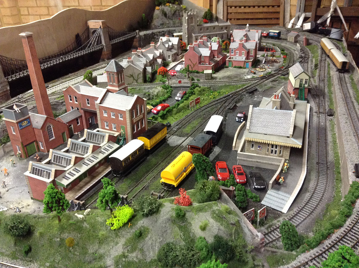
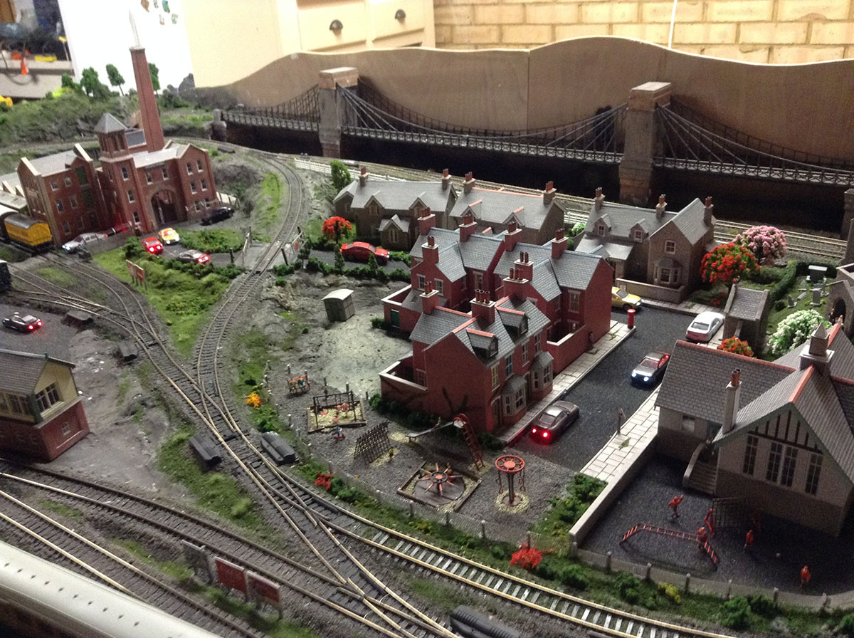
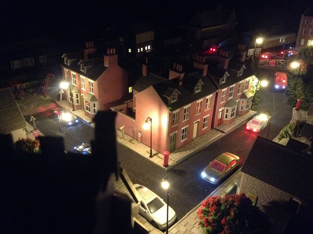

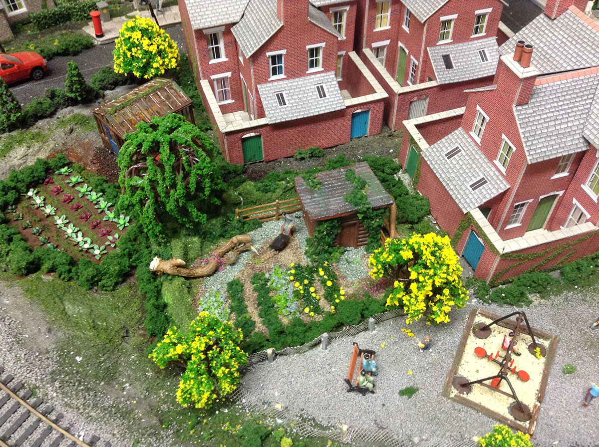
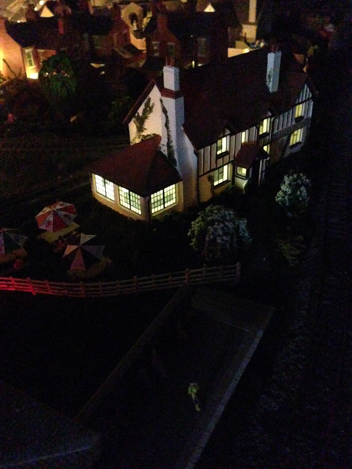
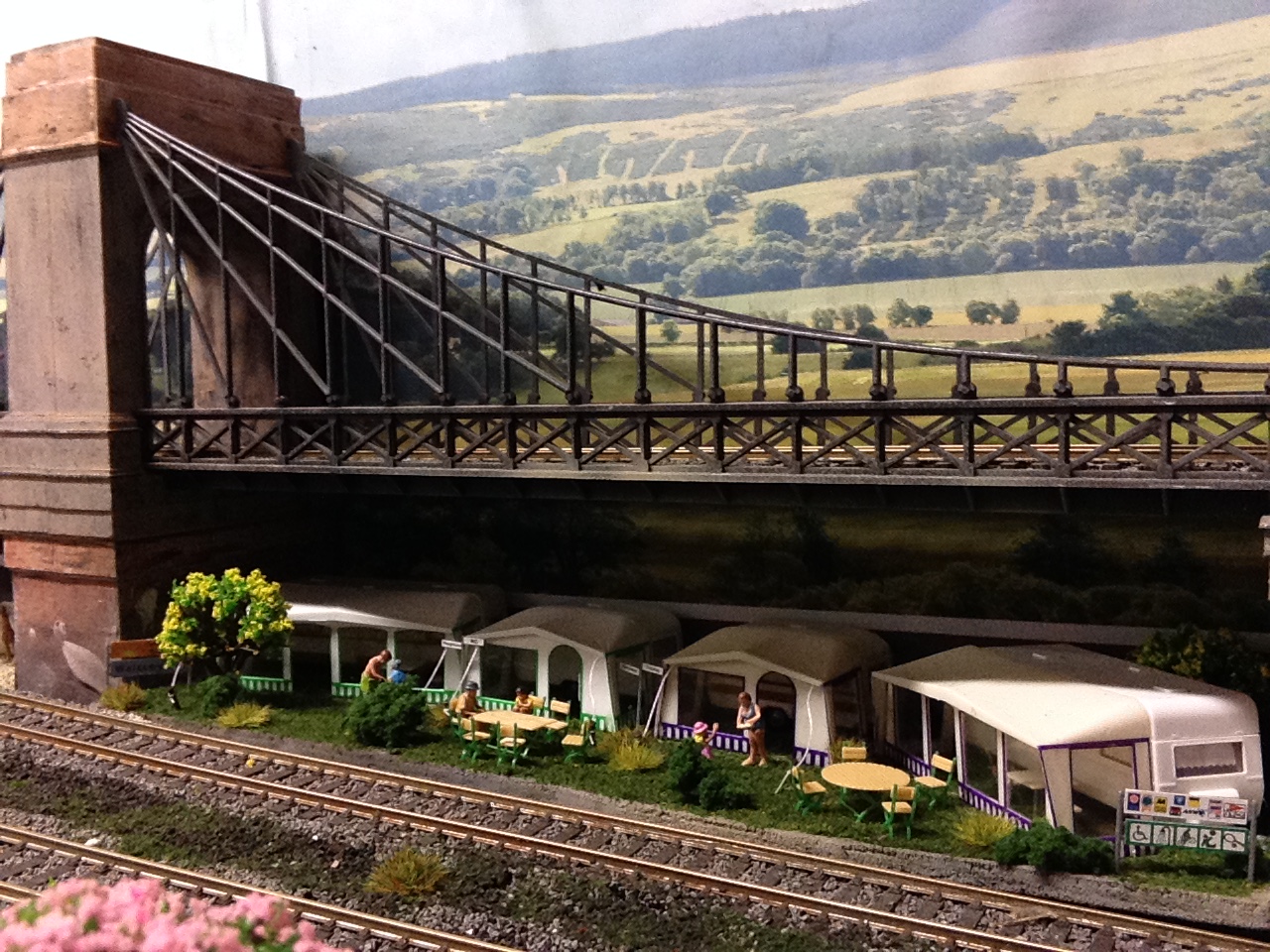
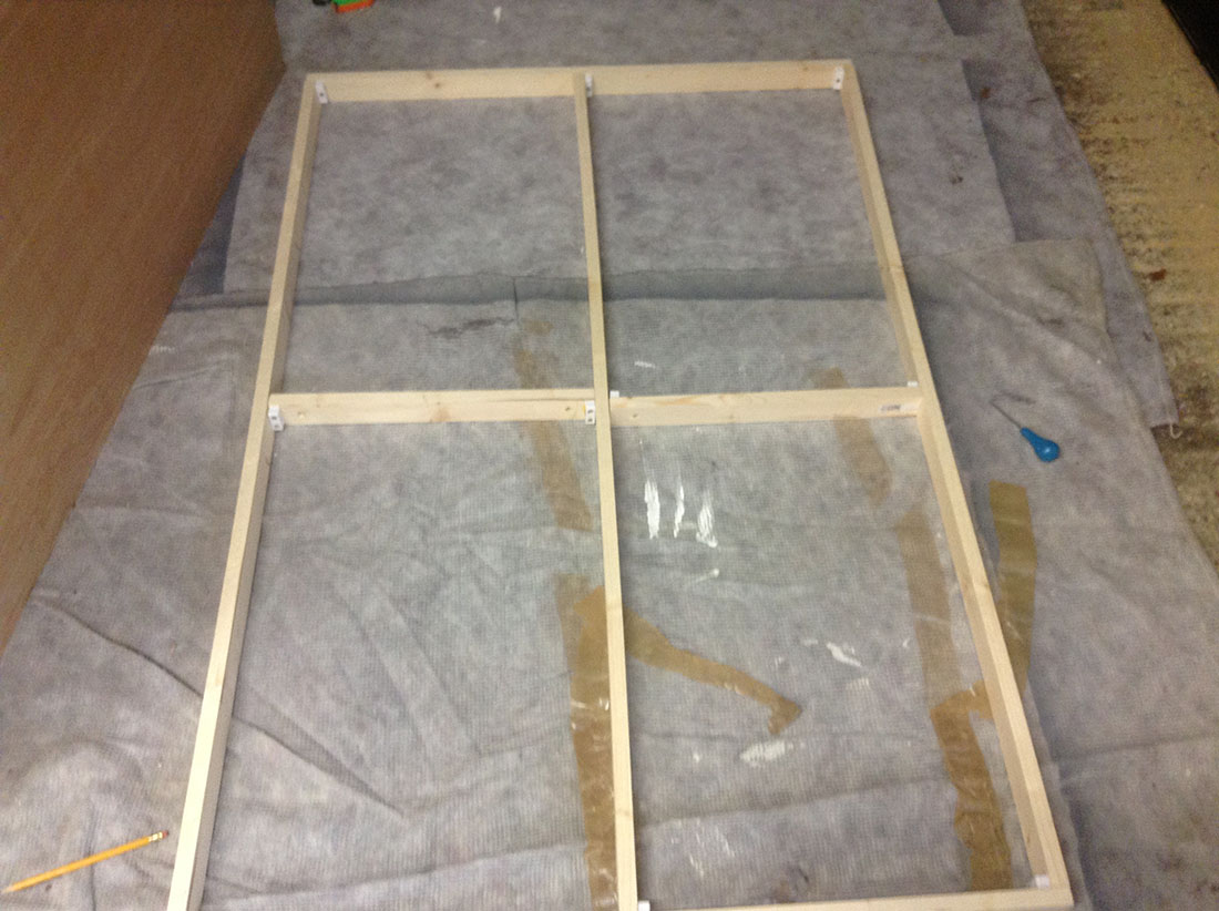
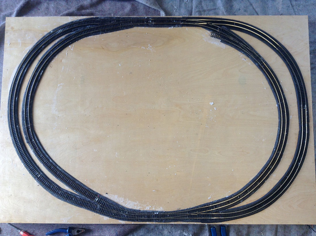
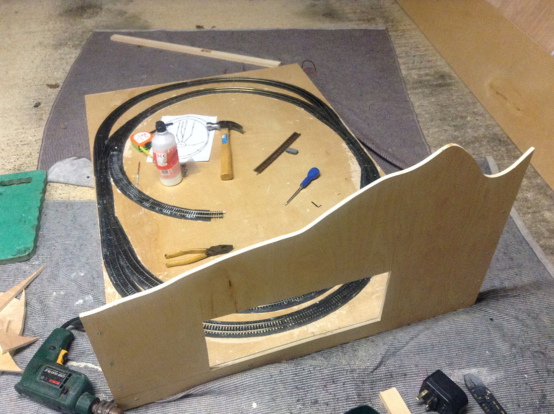
Great stuff Dave, love the lighting, seems to me that you have got that just right. Good eye for the detail. Regards, Peter..
A very nice layout you have built there David …Dangerous Dave
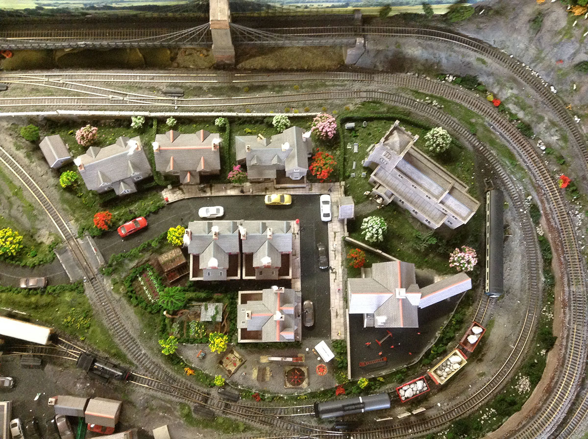
You have succeeded in cramming in a tremendous amount of detail without making it look overcrowded. The lighting is excellent. Well done.
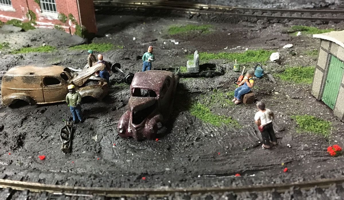
I particularly like the scrapyard.
Martin
David, Great work on the layout. The lighting is excellent, I really liked it, I wish I could get my layout lighting to look like that.
Chuck from NY USA
Dangerous Dave Check and see if your bridge is still intacked this Dave might have scoffed it , or not ,lol
Great Job David
The Critic
That looks great. I really love the idea of that turntable inside of the loop. That’s ingenious and I may have to take that idea for my future layout. That can certainly solve some issues in tight spaces.
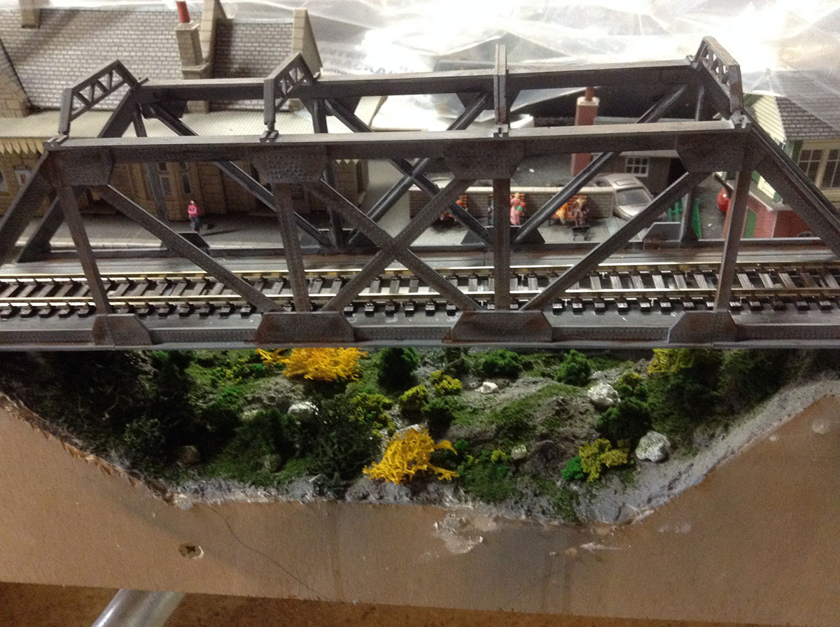
Fabulous layout David and that bridge is museum quality! Well Done!
All I have to say about these little movie sets is ” My that’s nice ” .
Now someone explain to me … WHERE ARE THE TRAINS ?
Did a criminal sneak in and steel them ?
Great Job . Looks Great !!
Inspiring. You’ve packed lots of interest into 8×4, without it looking over-egged. I do wonder about the inclines. They look like WS 3% ones, but you seem to have achieved a greater difference in elevation than this would provide. ( I trialled the same thing myself and could only get a height gain of 2inches (50mm), so I abandoned them and dropped a section of baseboard terrain to get 125mm below a viaduct …
Very nice detail, shows your love for the hobby. Keep up the good work, it inspires us all beginners.
Nice detail, Nice work.
I love this layout. My 6-year-old grandson couldn’t believe it wasn’t an actual town, it looks so realistic.
Well done
Fun!! Very nice work!!
Lot’s to like on both layouts.
Nice work David – a couple of interesting layouts.
Brian, Wokingham, Berks
Great lighting, would be interested in your technique.
Also, great detail.
Very nice layout Dave. Looks as well in the night as in the day time too. Love that long suspension bridge. Nice work.
Was thinking same thing about well done, not jam-packed with well balanced table. Meaning even the town(s) are just right, don’t add another thing…
Rich, Regards
Always appreciate posts showing “work in progress” elements. Shows, again, that with patience one can achieve some terrific results, as we see here.
Very nice layout David and great scenery
havent seen old rusty cars in a layout in a while, nice. good layout.
Nice layout!!!! I really like the lights it definitely gives the layout a different feel when the lights are on. Thank you for sharing your pics and ideas. Chris – Michigan
Great layout! The night scenes are spectacular. Enjoy looking at this layout, thanks for sharing!
Great layout design with realistic detail and just the right amount of detail which does not take away from the trains.