Jack’s been in touch with a bit of ‘forced perspective’, which reminded me of Ken’s model train 3D backdrop.
“After spending time under the layout wiring, I started to think about the backdrop.
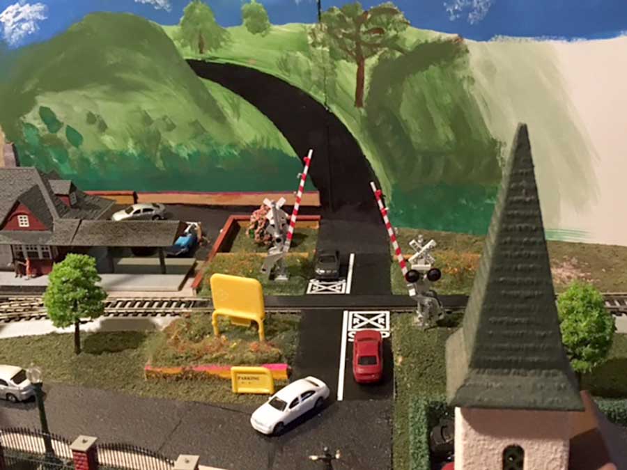
The easiest (I think) is to do mountains. The problem is that I have a street which terminates at the center of the back of the layout (see photo). Where is it going to go?
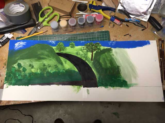
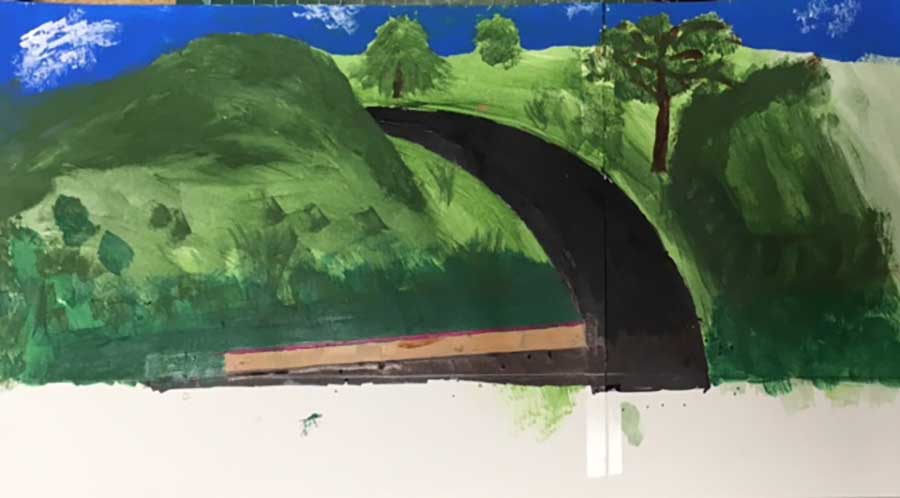
I got some of my granddaughters’ drawing paper and taped it to the back of the layout. I then drew a freehand road continuation, curving it to the left. I then used the edge of my paint palette to draw curved lines. I drew a hill in front of the curve.
There are two perspective issues. One is the parking lot and wall at the station. The other is the road. Using trial and error I adjusted everything until I got something I could live with.
I’ll have to transfer the scene to the Masonite backdrop. I’m not sure whether to try to paint the entire backdrop or to buy a backdrop and integrate the road into it. Any comments are welcome.
Continuing on the preliminary work on my backdrop I found another perspective issue.
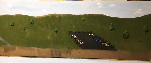
I have the beginnings of a parking lot at the edge of the layout, so I need to continue the parking lot onto the backdrop. I taped some tablet paper to the layout edge and marked the edges of the parking lot on the paper.
From the area where the scene is viewed I approximated the angle needed to continue the edges of the parking lot onto the backdrop.
I then took the paper down and from the point where each lot edge meets the background I drew a number of lines at different angles like spokes.
Reattaching the paper, from my viewing area I chose the lines representing the best angle for each side of the lot. I then drew the lot on the paper and quickly sketched in some scenery.
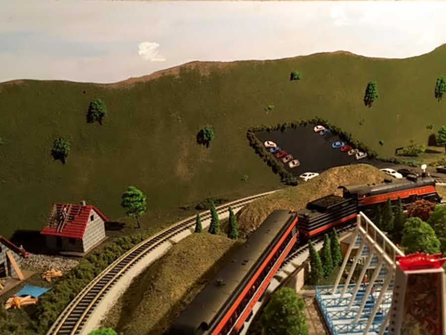
The photos show the final sketch and what it looks like from the viewing area.
I transferred the parking lot onto the Masonite and sprayed it to match the blacktop on the existing lot. I photographed cars on the lot from the perspective of the viewing area, printed them out, cut them out and pasted them on the lot. They aren’t perfect, I may redo them, but it gives the impression of cars parked on the lot.
For the grass, I used spray glue and sprinkled Woodland Scenics blended turf on it.
I painted the sky blue, added some darker streaks and clouds.
My real problem, and I could use some comments on this, is that I wanted to make it look like you were looking off into the distance. It just doesn’t look like I imagined it would. I think maybe my horizon is too high. Maybe I should start it just behind the parking lot.
Maybe I should start a hill just beyond the parking lot.
Any ideas would be helpful.
Jack”
A huge big thank you to Jack.
Perspective can play a big part in a layout, and there are lots of posts on ‘forced perspective’ and creating a focal point.
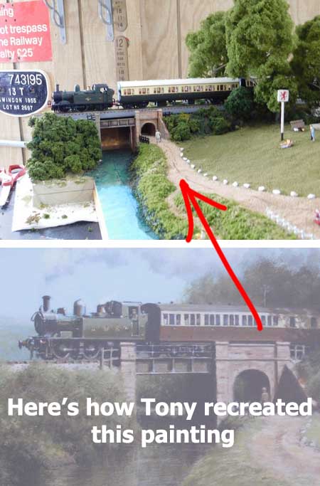
But do you know what? The post it made me think of most, was Tony’s.
And what a theme, and what a project too. He based it on a painting and recreated it:
Have a look and see how he did it, step by step.
And there’s Ned’s too: Painting backdrop.
I thought it was really clever stuff.
I have no idea why Jack’s post made me think of Tony’s – there is no scenery melting into a backdrop, there’s no backdrop at all.
The same goes for Fred’s, again, it’s clever stuff:
Forced perspective model train backdrop.
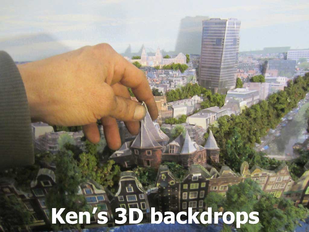
Another great example of making backdrops ‘less flat’, is Ken’s:
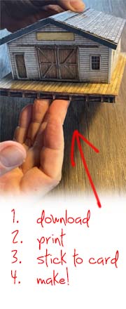
You can see Ken’s 3D backdrop, step by step, here.
Well that’s all for today folks.
It’s been a long old week for me, there seems to be one techical problem after another at the moment, but I’m determined to press on.
Please do keep ’em coming – it’s the easiest way to put a smile on my face.
Even with the technical gremlins tormenting me, I always look forward to see what’s landed in my email.
And if today is the day you get stop dreaming and start doing, just like Jack, Tony and Ken, the Beginner’s Guide is here.
Best
Al
PS Latest ebay cheat sheet is here.


I agree with Jack in that the horizon is too high for the layout – not the mountains, but maybe shortening the height for where the road disappears behind what could be the nearest mountain or hill.
I tried forced perspective and it did not work. Yours looks great, continued success.
CHEERS! NJ Mark
Jack, I’m dealing with similar perspective issues, many years ago I studied art so perhaps I can help. The vanishing point for your perspective “lines” needs to be much lower and to the left more. Ignore the hills, they are farther in the background, if that is helpful. I have several brick streets that run into my backdrop in the town part of my layout, storefronts on both sides of the street, or sidewalks, trees and houses, depending. They will deminish rapidly from like 4” to 1-2” and vanish over the horizon or into the overhanging trees. Just little triangles or trapezoids really. Some store buildings might be part built and part painted in perspective, it gets tricky because the foreground structures aren’t built in perspective! Good luck!
Some neat ideas here, forced perspective allows your layout to go on for miles and mlles…
There are two problems with false perspective:
1. Mathematically – you can only make it work perfectly from a single eyepoint. So if you’re standing perfectly in line with the road disappearing into the background – or if you take a photo from that position – you might get it to look really good – but take a step or two either side of that line and it’ll look hokey as all hell!
2. It’s important that the scenery has less and less vivid colors – and progressively greyer blacks and whites. In reality, the atmosphere always softens the colors in the distance. This is something that can break the illiusion even over the length of your layout board (where you can’t do anything about it) – but the further away the backdrop is trying to be – the softer and more pastel your colors need to be.
When you get these things wrong – you actually make the cut-off look worse rather than better. I’ve been watching the “Everard Junction” videos on YouTube and that guy is VERY clever at hiding the transition from 3D model to backdrop – but he does things like building hills that roll downhill towards the backdrop – and he also has the layout’s baseboards fairly high up which forces you to look through the scenery rather than down onto it…which ALWAYS improves realism.
AS far as the parking lot goes–it is slanted in the wrong direction.. It should be slanted to the right (not straight on or left) to make it match the house on the left side of the picture’. .
Jack, another option I have used is to have a tunnel portal at the end of the road. You can get creative with painting the “inside” of the tunnel rather than just making it look like a black hole. You can also build the portal with a design that is consistent with your buildings and other scenery.
maybe with the parking lot paint it so it looks like they cut into the hillside and built a retaining wall ??
nice blend ins
I like welder Dave’s idea, above.
Parking lot as mentioned needs a smaller lot as disappearing into background, not “ bending” up the hill.. something like a half triangle if that makes sense.